Summer 2012 Update

It’s hard to believe it, but Summer’s almost over! While it’s still a bit “sultry” outside, as one of our friends likes to say, we thought we’d give you an update on some of the “summery” things we’ve been working on these past few months!

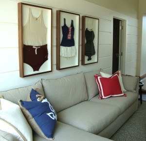
Shadowboxed Vintage Swimsuits Laketown Wharf

These shadowboxed vintage swimsuits from the 40’s are a fun addition to a project we worked on down in Panama City Beach with one of our most favorite design firms. As tempting as it was, we did NOT try them on before framing them. They were a little smelly to be honest…

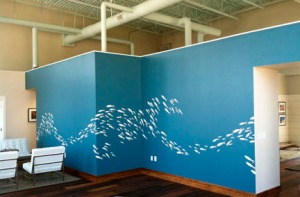
Abstract Fish Mural

This abstract wave of stylized fish was created by our awesome graphics team for the Laketown Wharf project, and it spans over 50ft. of wall space.  Kudos to the installer too,  she did a terrific job!

Hyatt Miami Blue Stairwell Sculpture

We are asked for affordable sculpture A LOT!  It can be a challenge to procure  pieces that deliver the visual impact and SCALE required while also satisfying a budget.  This piece was commissioned with a California artist who works in glazed ceramic. The craftsmanship on these pieces is absolutely top-notch and the piece is perfectly suited to it’s Miami location.

Hotel Indigo Garden District Crown Image

We are fortunate to be working with a great team of folks on the soon-to-open Hotel Indigo Garden District.  The photographic imagery for the murals and framed artwork are all neighborhood based , and really could you ask for a better neighborhood to shoot?.  Our photographer had a beautiful few days to capture the area,  and this imagery is just AMAZING! We can’t wait to share more of the finished project with you, but we thought we’d post this image-it’s been a favorite of everyone who has seen it.

…and finally. Meet Luca!

As some of you know, we lost our beloved Shepherd Mix (and official Art Initiative mascot),  Sophie,  to cancer,  after 13 years together early this Summer.  Life is wonderful in the way that it can bring joy while sadness is still present, and Luca is proof of that.  She’s 5 mos. old, weighs in at over 50 lbs.,  and is all goof-ball.  She’s here most afternoons, so if you’re here in Atlanta-come on by and meet her!

Hope you’re having a great Summer! Squeeze some more fun out of it while you can! We’d love to hear from you, so give us a call or drop us an email, if you’d like to talk art!

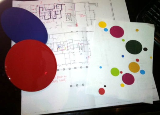
From the Desk to the Wall

Rarely is our process so succinctly visual as it was this morning when I walked in.  We’ve been working with an artist on the design for a two-story stairwell sculptural piece in Miami for the past few days, and it kind of stopped me in my tracks to see it there in flux and on pause at the same time.  It’s all there-the composition, the scale, the palette, the materials, and to some extent-it’s destined location. I snapped a quick shot of it, so that I could post the installation shot for you in a couple of months when the piece is installed.  What happens next is the part that I’ll never stop being blown away by, and that’s the creation by the artist of the actual piece, because right now-while it’s a cool picture, that’s ALL it is until the artist breathes life into it.
Truly astonishing.Image

The 3 Mile Radius

Sometimes the tight parameters of a project  can actually be a beneficial aspect of the process.  This was the case recently,  as we were asked  to curate a collection of 21 images representative of the College Park neighborhood in South Atlanta for a hotel brand. Given a 3 mile radius to the property to work with for imagery, we settled on a fine art photographer we knew could find the soul of the area.  As fate would have it, and unbeknownst to us at the time, the photographer had a deep connection to the area, having lived in the neighborhood many years ago.  What he was able to capture in a 2 day shoot was pretty astonishing.  Rusted trains with spectacular graffiti,  vintage Americana signage, and gorgeous textures of peeling color and grit that look like paintings.  I remember thinking when we heard about the 3 mile radius we would be restricted to-“That’s so small!  How are we ever going to pull this off?” and now I know it wouldn’t have been the same had we been given a larger scope to work within.  So,  sometimes what we think of initially as a constraint, (budgets, palettes, etc.)  actually force us  into more creative thinking and better work.


OK, first things first. Wow, have I been remiss in my blogging duties…I’ve been working on another writing project for the past few months, and things are hoppin’ again over here at the Plow, so while I was THINKING of all the fascinating blog topics I wanted to share, I wasn’t actually blogging, and for that I am deeply regretful. OK, not DEEPLY regretful, but I  did miss it! So  last night we were having dinner with an artist friend and his wife, and the discussion turned to the endless requests he receives for donations of his artwork to various fundraisers throughout the year.  What some of the folks asking for the donations don’t realize is that artists donating their own works are only able to deduct the cost of materials (in my friend’s case-canvas and paint), not the fair market value of the work.  It’s incredibly unfair that artists are not afforded the same deduction benefit as a private collector, who (with documentation) would be able to write off the fair market value for the same piece!  H.R.1190 The Artist-Museum Partnership Act of 2011 was reintroduced in the U.S. House by Rep. John Lewis (GA) in March.  You can read more about the status here: https://www.popvox.com/bills/us/112/hr1190/report#nation  and here: http://www.govtrack.us/congress/bill.xpd?bill=h112-1190 .   Let’s work to change this nonsense, and at the very least–let’s not take for granted the real sacrifice artists make when they donate a work to charity.

Salon Style Groupings

Yesterday we finished up a project (see image below) with a couple of very large salon-style groupings, and since we are being asked more and more to design these collections of groupings for our clients,  I thought I would pass along some tips for putting them together.   The salon-style of hanging came about historically as a very efficient way to showcase the many works of the recent graduates of the Royal Academy of Painting and Sculpture in pre-revolutionary Paris at the  Salon de Carré at the Louvre.

Nowadays,  it’s used aesthetically to fill a large space by showcasing a lot of smaller pieces. It’s a great look,  and can be an interesting and really personal way to showcase your style.  It’s pretty cost-effective too since you utilize a lot of negative space. You  probably already  have a lot of small interesting imagery you can use in your composition too! Variety is the name of the game-Photos, bookplates,  old keys, sketches, flea market oil paintings,  all work great!  Get nostalgic (think vintage) and creative.  I like a wide variety of frame styles and frame finishes too.  It should look like a collection assembled over time.  You can have your artwork custom framed or shadowboxed by a framer,  or if you’re up for  a do-it-yourself  project, you can visit your local craft store for a good variety of ready-made frames you can fit on your own.

Once you have your framed art together, you’ll need to lay it out on the floor preferably in front of the wall you’d like your grouping to hang.  We usually make a box out of painter’s tape, the general size of our grouping. Once you’ve got your composition together, it’s time for the not-so-fun part of  making a diagram of your layout,  and measuring between each piece.

Once you have your diagram, start by hanging the piece near the center of your layout and then build from that piece, hanging the piece above and below. Then hang the pieces on either side and keep building until you’re finished!   Admire your grouping-it’s uniquely yours!

Salon Style Grouping Serrano

Banksy’s Exit Through the Gift Shop

[youtube=http://www.youtube.com/watch?v=GTlm6dU2xHk]

Billed as “the world’s first street art disaster movie”, the Banksy documentary Exit Through the Gift Shop is a compelling delve into the elusive world of the pseudonymous street artist Banksy and more broadly, a look at the over-commercialization of the contemporary art world.  If only it were that simple.  The film follows the unlikely pairing of French shopkeeper turned videographer Thierry Guetta and the, up-until-now, largely anonymous street artist & provocateur Banksy.  Guetta is ever-present, recording every detail of Banksy’s studio and working methods for a street art documentary he’s ostensibly working on.  Turns out Guetta isn’t a filmmaker at all, but (as Banksy describes him),  a “mentally ill person with a camera”.  Banksy decides, at this point,  to turn the tables on the Frenchman and  begins filming  Guetta as he adopts the moniker “Mr. Brainwash” in an attempt to instantly fashion himself an artist’s persona and career.  There’s so much more, but I’m not giving it away. See the film, and decide for yourself if it’s real (Banksy swears it is), or if it’s  just a really, really clever Banksy piece.

Ok, Art History Quiz Time…

[youtube=http://www.youtube.com/watch?v=erbd9cZpxps]

So how many did you get?  Love this video from the band Hold Your Horses!  Have to say, they even stumped co-director and all around smarty pants Kimberley Campbell with a couple of these!

Art Basel Round-Up